Project Summary
Evoke is a beauty brand built to meet the needs of modern consumers: ingredient-conscious, minimal, and refined. Designed for real life, Evoke strips away the excess, leaving only what’s essential to simplify and elevate everyday routines.
The Role
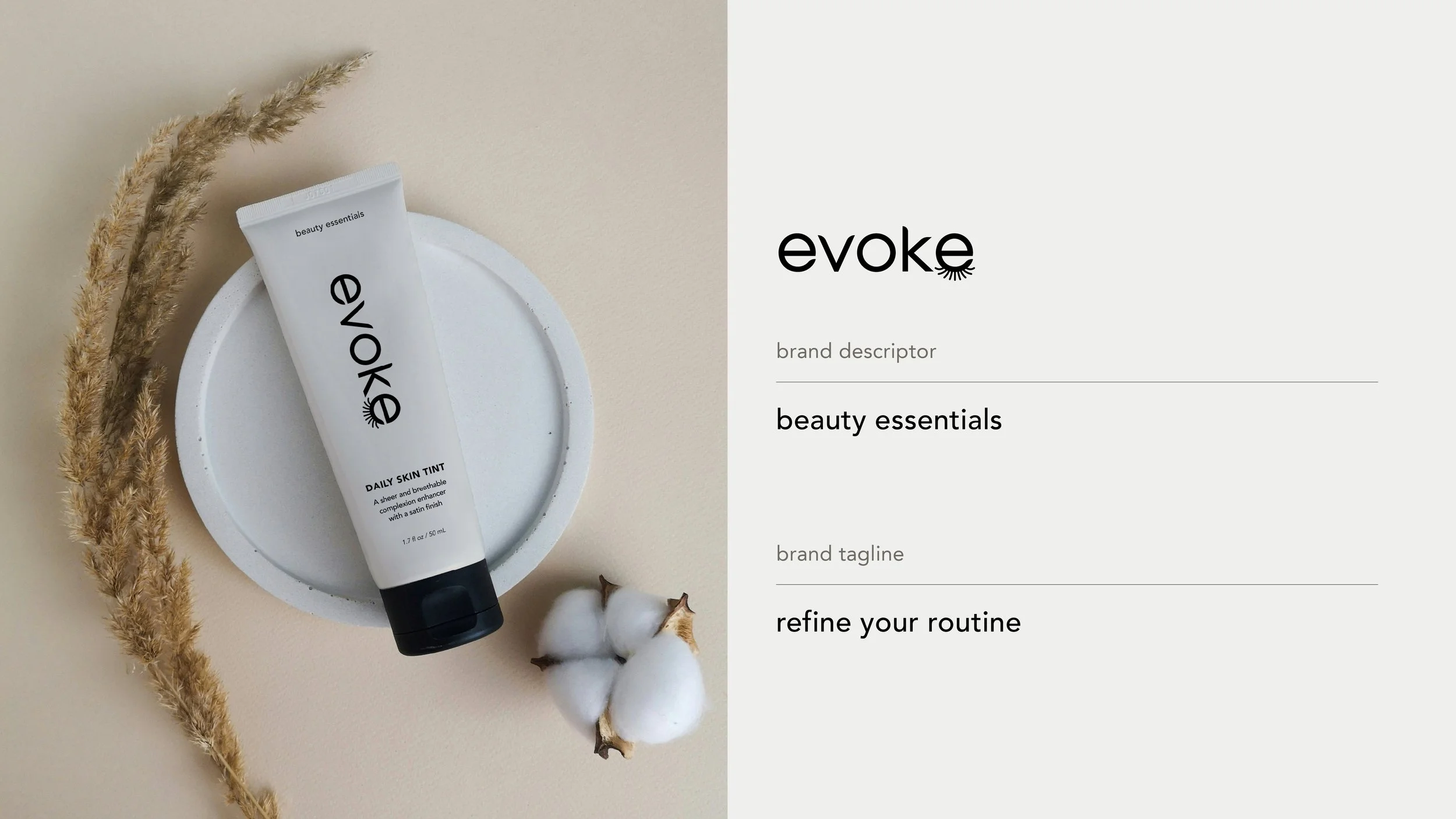
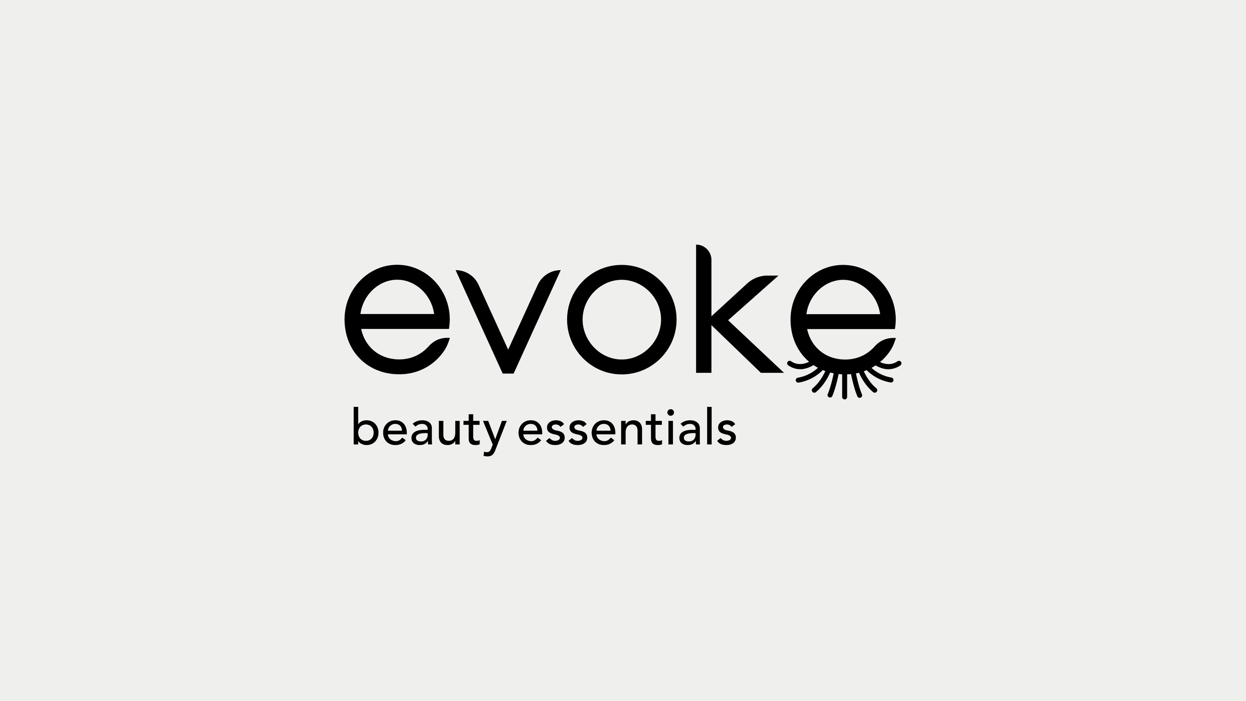
Naming: Developed the name Evoke to suggest consumers evoking their best selves. This name is rooted in emotion, while remaining sleek and modern.
Strategy: Positioned Evoke as a modern, minimalist beauty line focused on essentials rather than excess. Defined brand values around ingredient-conscious formulas, simplicity, and refinement.
Messaging: Crafted the brand descriptor “Beauty essentials” and tagline “Refine your routine” to communicate clarity, purpose, and everyday clean luxury.
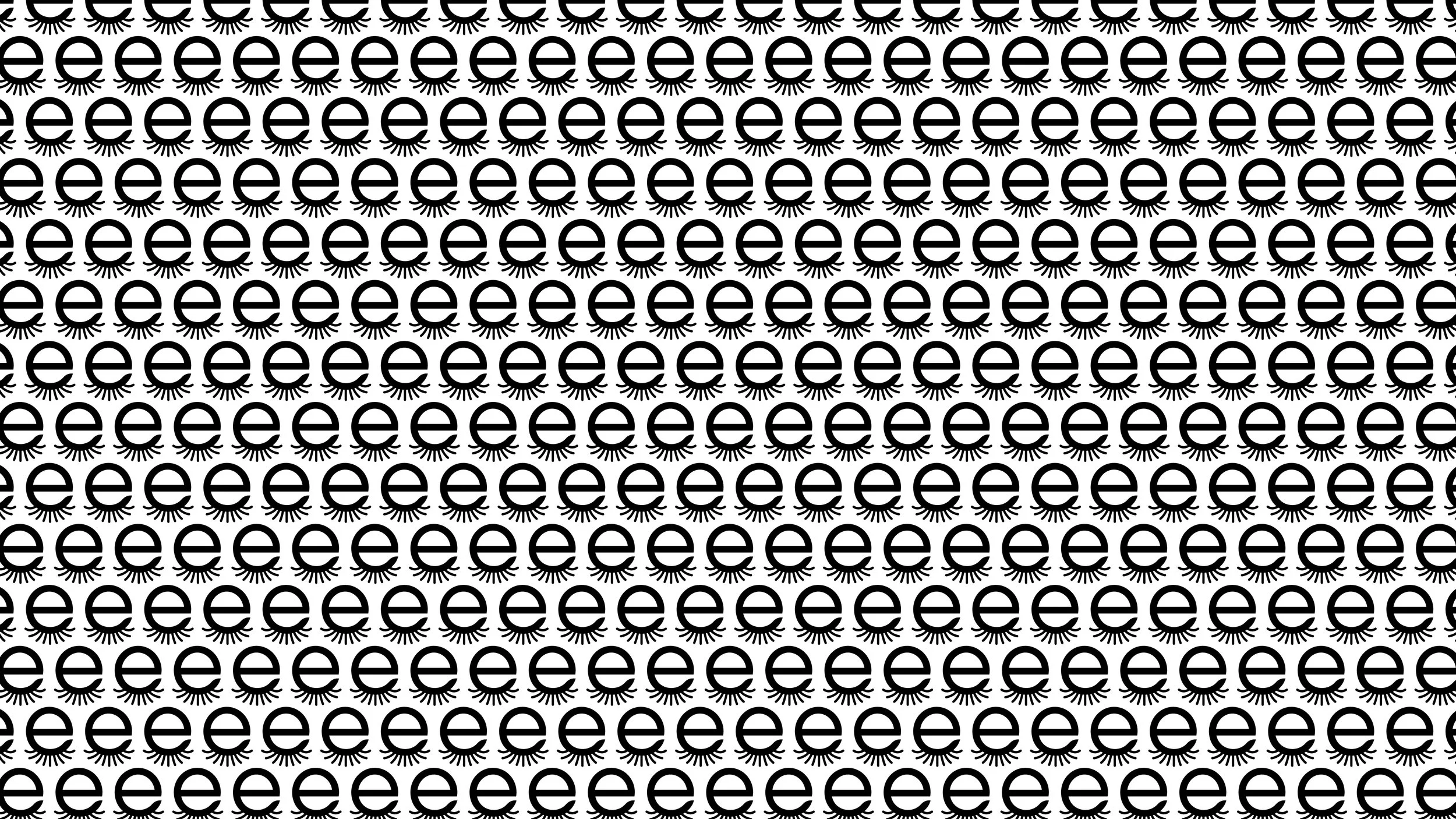
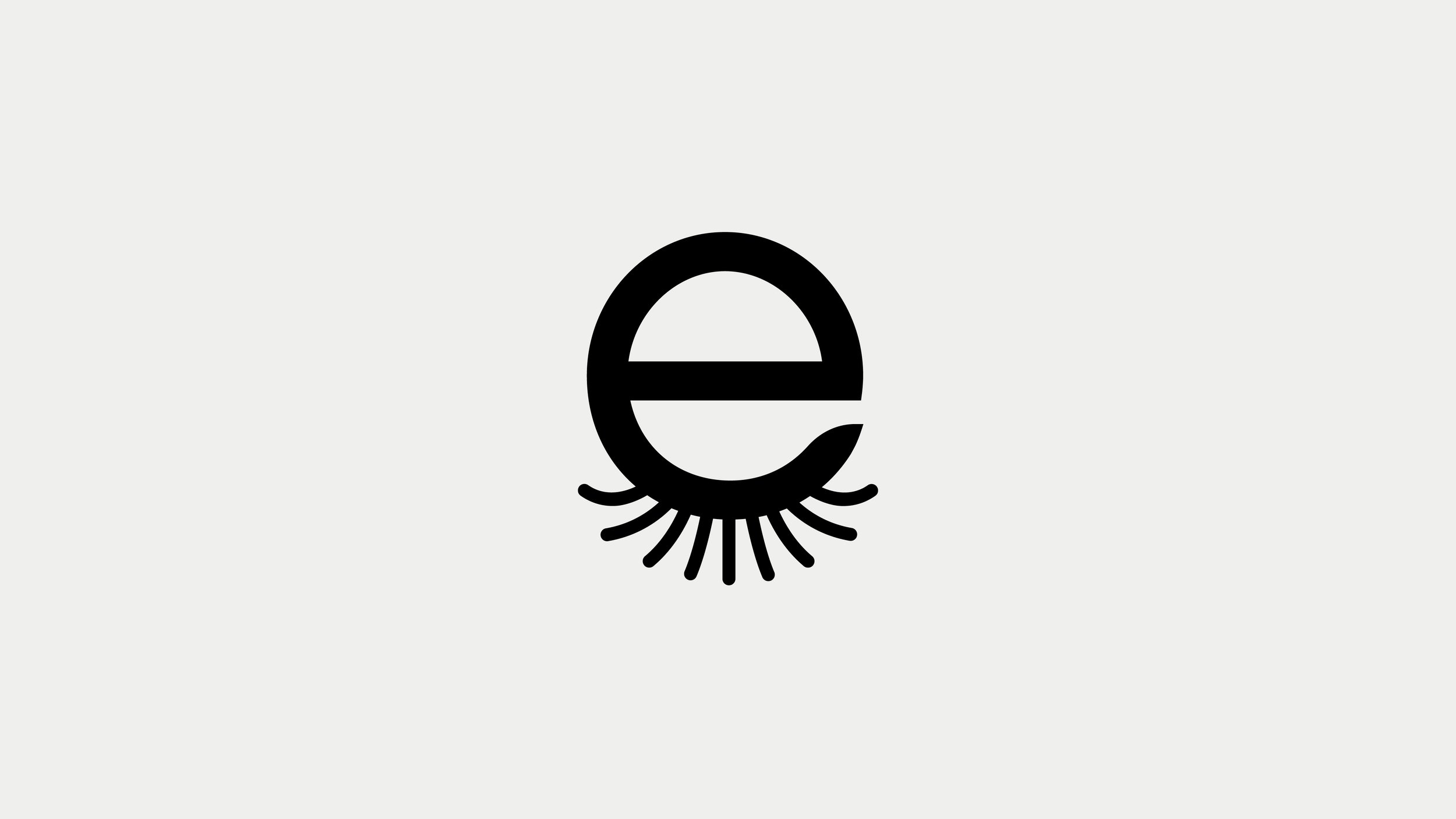
Identity Design: Designed a custom wordmark with a clean, contemporary aesthetic, supported by a logo mark that doubles as a bold icon and repeating brand pattern.
Packaging: Created packaging that mirror the brand’s philosophy: clean layouts, neutral tones, and considered details that feel as refined as the products themselves.

The Outcome
The Evoke brand system balances minimalism with memorability. Its pared-back identity and purposeful language establish a strong foundation for a product line that feels both accessible and aspirational. The visual identity extends seamlessly into packaging and collateral, building trust with consumers who want simplicity without compromise.